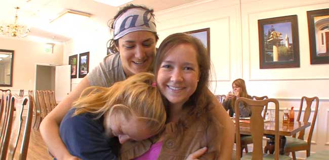
 Photo by Andrey Gorlov, using a Canon 550D.
Whenever I discover that what I like and admire is rejected — or, even worse, when what I dislike is liked and praised by others — I stand back and wonder: Can I be right all the time? In my world, the answer is yes.
SLICK AS HELL
Take TechCrunch. Today, head cruncher, MG Siegler, is raving about a new Facebook Places video on YouTube. Read his write up here. He must be on strange substances as he thinks it is (a) as slick as hell and very nicely done and (b) it looks like an Apple video.
It’s slick as hell — very nicely done. In fact, we weren’t the only ones who initially thought that it looked like an Apple video. The correct way to do these things either seems to be to go for humorous/hipster (like Square) or sentimental/simple (like Apple).
With their Places video, Facebook actually sort of combined the two — it’s the ultimate sentimental/hipster video. As I said, it’s very good. My favorite parts are the bits where the iPhone is searching for service — welcome to life in the Bay Area with AT&T.
YOU’LL WONDER WHERE THE BACKGROUND WENT
Come on MG. You can’t be serious. It’s a fad driven infomercial. Looks like a Canon EOS 5D Mark II shoot, high on bokeh, low on content. Put me off Facebook Places forever.
See the video here on YouTube HD.
I have to agree with the honest commenter who wrote: Facebook Places is the social network equivalent of dogs peeing on fire hydrants.
This one too: Come on. With the schmaltzy music, and earnest geeks, you think this is good? If every one of my friends on Facebook starts posting where they are all the time, I’m definitely going to turn that feature off. Next, they’ll be having their dogs check in at the dog run.
Here’s a frame grab from YouTube. The commercial is about Facebook’s Places. Yes, PLACES. Any idea where this dude is? Are they flags on the LHS? Is this in a shop, a mall, or is he lost somewhere in a Facebook continuum? No one knows where he is. But wait; his Facebook page reads: “Today, I was in a slick as hell video.” Woo hoo; he checked-in, now we know where he was!
The concept and execution of this infomercial is all floss and ephemeral trivia — from the oh-so shallow depth-of-field, to the burnt-out the overhead lights. There’s nothing authentic or real about it.
Where did real go? What happened to the Whole Earth Catalog?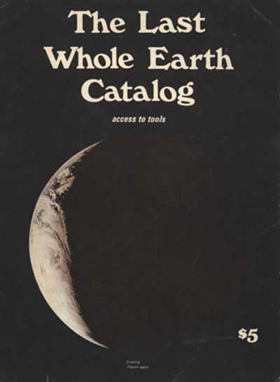
PURPOSE
We are as gods and might as well get good at it. So far, remotely done power and glory — as via government, big business, formal education, church — has succeeded to the point where gross defects obscure actual gains. In response to this dilemma and to these gains a realm of intimate, personal power is developing — power of the individual to conduct his own education, find his own inspiration, shape his own environment, and share his adventure with whoever is interested. Tools that aid this process are sought and promoted by the Whole Earth Catalog.
Well it’s gone. In its place we have: My Space, Facebook, Foursquare, Gowalla, Twitter, YouTube and TechCrunch. This is progress.
I LIKE REAL
Here’s Bob. He’s been working for the same company for 40 years. I shot him in his lab with my incredibly out-of-date Sony V1 camera. He’s real, straightforward and honest.
I can’t imagine him checking-in to Facebook. No matter, we know where he is. He is in a laboratory. Duh.
It’s all too easy to give the shot an over bright, out-of-focus background. Took me just five minutes using the rotobrush tool in After Effects CS5. Separate the background and throw in a ton of Gaussian blur and Exposure effects. I don’t like the look and neither would my industrial client. It’s fake.
GO FOR BOKEH
So why did the cameraman and the director of the “very nicely done, slick as hell” Facebook Places video go for bokeh?
First, because today’s DSLRs can do it no problem, slickety-slick, and second, because it’s modern, fashionable and trendy. It’s Cool. Today’s video equivalent of hula-hoops, lava lamps or pogo sticks.
While traveling in Burma, George Hansburg, the pogo stick inventor, came across a poor farmer and his daughter, Pogo. The farmer couldn’t afford to buy shoes for his daughter, and therefore the daughter couldn’t walk to the temple to pray every day. So the poor farmer made a jumping stick for her.
How about: One day, a poor filmmaker couldn’t afford to shoot 35mm color film, He wanted his daughter to think he shot film, so he bought a Letus 35mm adaptor for his Sony EX1 video camera. Does it look like film? Yes, daddy, it looks like Conrad Hall shot it. That’s my girl.
Combine over-the-top bokeh with Magic Bullet Looks and the only limit is your creativity. Just kidding. Adding a pre-made filter is not creative.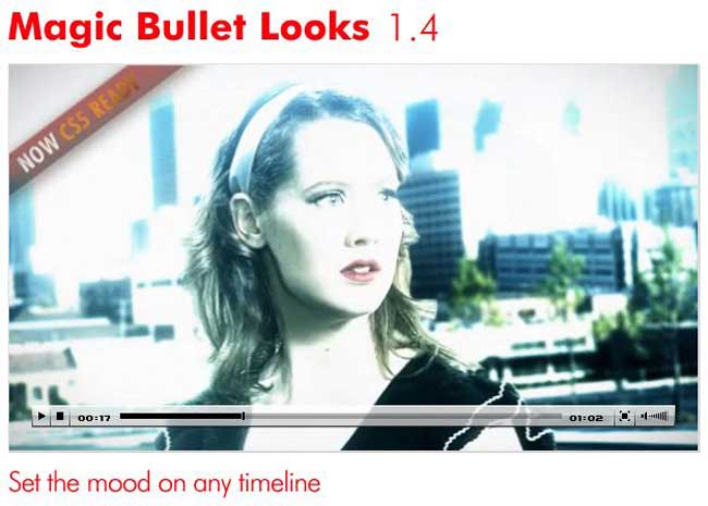
YOU KNOW IT ISN’T A DREAM, IT’S LOVIN’ BLOOM
The high priest of the bokehsphere is Philip Bloom. I admire Philip’s get up and go. I don’t have to like his videos with in-your-face bokeh, Magic Bullet color tinting plus time lapse and/or slo-mo motion effects. Can I be wrong?
Sadly, yes. Once again, I’m out voted. The guys at Lucas’s Skywalker Ranch love him. They flew him to San Francisco on a teaching mission. Armed with his now aging Sony EX3, a well used Letus adapter and his Canon 5D MkII, he rents a car and drives straight past my house on his way to the Ranch. Read about it here.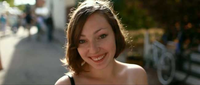
Still from a bokehsphere video by Bloom
Making the background go soft and fuzzy is a piece of cake. If it were hard to do, nobody would do it. This true of all fads. Fads are only fads if they’re easy to copy. Someone does something novel. It looks or sounds great – everyone joins in – it’s a fad – then, poof, it’s over. Looks silly and outdated. Quick, hide the lava lamp.
Fads come and go. Let’s start with Hitchcock’s 1959 Vertigo — the famous track-in-zoom-out shot. These days it’s called a Contra Zoom by the trendarazzi. Spielberg stole it for Jaws in 1975. Scorsese too in Goodfellas in 1990 – the scene in the coffee house. Oh, Spike Lee in Do the Right Thing in 1989, a quick one in Paul Anderson’s Event Horizon in 1997. And those are just the big name directors. The effect was copied by hundreds of lesser known filmmakers and wannabes. Boom — that’s it. Bye, bye Contra Zoom.
What self-respecting 2010 movie director would use Contra Zoom? The old guys did it way back in the previous century because it was all the rage and easy to do. And it wasn’t stealing; oh no, it was … homage.
CANTED CAMERA
In 1986, I working for Philips, in Holland. There’s not much to do in Eindhoven, so back in my hotel, I watched endless MTV pop videos. One after the other they were in B&W but with one color (red was favorite) lifted out of the monochrome. Video after video, all with the same B&W with a dash of color style. Weird.
Ten years later, I was booked for a company convention. My client had hired ITN, the major new organization in the U.K., to satellite broadcast the conference worldwide. Their top-flight, experienced cameraman set up a great looking shot while his young assistant took handheld, B&W, Dutch angle shots with a cheap camera. The live broadcast director cut from one to the other throughout the interviews. Ugh! Thank God that nutty interview technique was short-lived.
But the Dutch angle has survived. Film critic Roger Ebert, wrote “…director Roger Christian has learned from better films that directors sometimes tilt their cameras, but he has not learned why.”
New looks that are hard to copy never become fads. Take the deep focus look of Welles’ Citizen Kane. The very opposite of bokeh, but, unlike bokeh, it is almost impossible to copy. Look at the sliding walls and furniture in Jamiroquai’s “Virtual Insanity” directed by Jonathan Glazer. Try and do that. It’s a fad-free style. New, fresh, original and a swine to replicate.
WHEN WE WERE KINGS
Okay, I admit it. Years ago, I too was young and trendy. I had just left the BBC and went back to Australia with all the “slick as hell” tricks I’d learned.
I reveled in backlight with a smear of Vaseline gel on the lens. Couldn’t shoot without it. My 1966 equivalent of bokeh and Magic Bullet. Look at the burnt-out top right hand corner. Then flip back up to the 2010 Magic Bullet photo. Hmmm, I was so hip!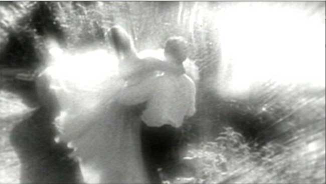
Here’s a frame grab from my ballet video. See it move here.
One day in the late Mad Men 1960s, I was at an ad agency and the creative director said that he was tired of my backlit blurry commercials and wanted me to try a new style. I was shocked. My hip was now tired and un-cool. The commercial was for Reward Soap, Your Reward for Being a Woman. Honest. I couldn’t make this stuff up.
All I had to do was re-create an existing U.K. commercial. They even gave me the U.K. lighting set up, camera lens and frame rate details. That was the start of my soft, bounced light period. Everything looked beautiful, lit by soft wrap around light. Clients were queuing up for “my look.” Those were the days. I was cool again. Sigh. But it was an illusion, both my commercial filmmaking and the phony stories. Your Reward for Being A Woman. A cake of soap as a reward? Oh well, I won awards and got paid.
I’ve changed. I was cool but now I’m not. Today my style is real. I like to think it isn’t a style. It’s just simple, straight forward, no tricks and honest. Fresh squeezed orange juice, a lettuce with oil and vinegar, ocean waves on rocks, Bob in his laboratory…
IN PRAISE OF REAL
My wife Tricia has a business making natural linen bedding, Rough Linen. First find the right linen. Linen like her great grandmother’s homespun linen pillow. Tricia’s goal was to make bed linens as simple and elemental as her heirloom from the 19th century.
While I was revamping the Web site, I asked Tricia to write her beliefs for a page called CREDO. She wrote it in minutes. Is it any good? It’s perfect.
I like real.
I want to do everything myself, hands on. I love skill. I love to pare things back to the bone, to the essence.
I want to know provenance, history, my heritage.
I admire an elegant sufficiency. I like things around me to be comfortable, hardwearing, trustworthy, understated, utterly fit for the purpose.
I miss old towns and villages, the sense of a community deeply rooted in place, building, tending, understanding, appreciating, generation after generation and for the future. Connection, identification, pride, responsibility.
I resent advertising, branding, labels, the victim side of fashion – but appreciate hard work, creativity, talent and play.
It made me think about my own trade, my own credo. Do I want to make films that are “slick as hell” or “as real as hell”?
Real can be funny, thoughtful or serious. Sadly, this video is serious. No cheap tricks, fads or gimmicks, not even 24P. Pared right back to the bone to tell the story of brave Jill Costello.
I filmed Jill on September 28, 2009 and later on May 16, 2010, her graduation day. Five weeks later, on June 24, Jill died, aged just 22.
The original video was made for The Bonnie J. Addario Lung Cancer Foundation. John Catchings did the production and interview. After Jill’s death, I edited this minimalist, Jill-only version with additional stills from James Hall’s video on Vimeo.
View it here.
If Jill’s short life moves you, donate here.

